Even with smaller projects, I try to emphasize modularity. Changing one thing is always better than changing two. After learning more about structuring code with BEM, I decided to learn more about CSS processors, namely Sass.
I implemented the BEM architecture in my HTML and JavaScript code and gave my page a clean, semantic structure. Although my word counter functioned properly, it wasn’t exactly beautiful.
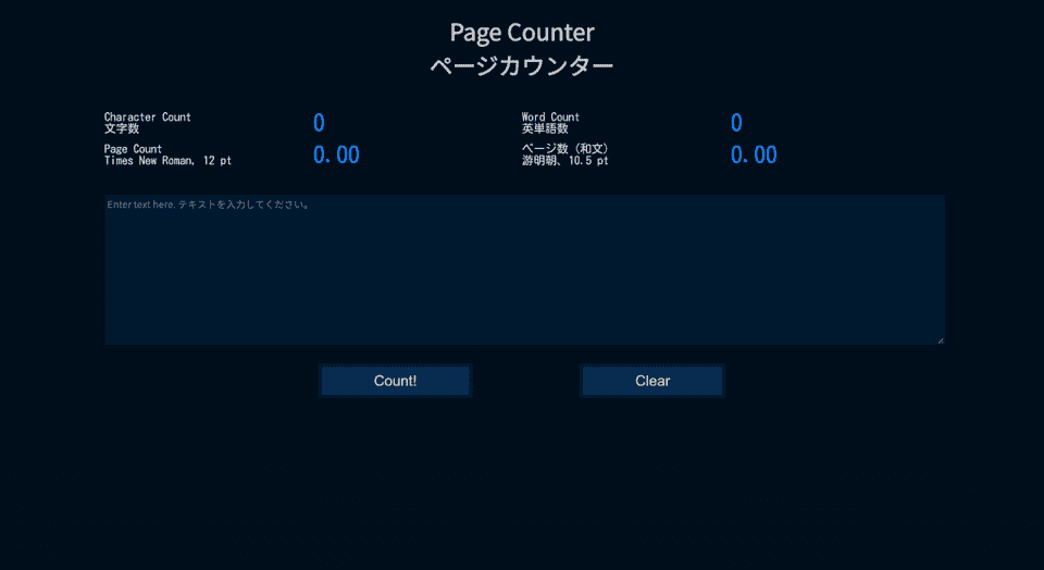
Page counter without any style
Given how simple the page itself was, I decided I wanted the style to be reasonably simple and easy on the eyes as well. I changed the placement of the content using CSS grid and borrowed inspiration for a color palette from CopyPalette. I used the Accessible Color Palette Builder to confirm that there was a large enough contrast between my background color and font color.
Page counter with accessible “dark mode” style
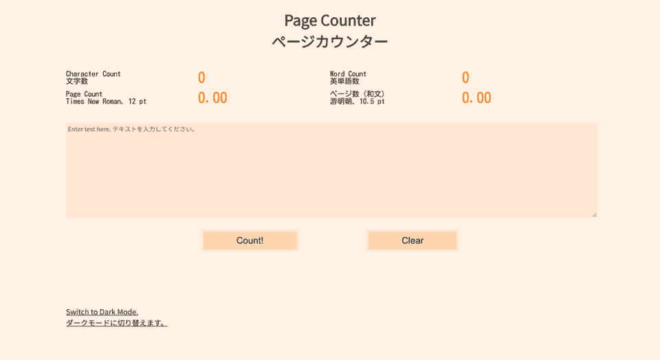
I decided to lighten the colors of the website using the invert() function in CSS. This way, I would maintain the same amount of contrast for accessibility. I added a bit of text at the bottom of that would allow users to toggle between dark and light mode. The JavaScript for the toggle swapped out the dark mode stylesheet for a light mode stylesheet and vice versa.
I created an additional stylesheet for the light mode version, but I didn’t want to copy over all of the CSS from the original stylesheet. Instead, I looked toward two of the modularity features that Sass offers.
I stored my color palette using the variable feature. I referred to colors by only their variable name for the rest of the stylesheet, so I only needed to invert each color once, when I declared its variable. This is a great improvement from searching and replacing for each instance of a color!
Secondly, I created a module to reuse for both the dark and light stylesheets. The only thing that would change in each stylesheet was the color palette. Therefore, I decided to put the rest of the content of the stylesheet into a separate .scss file. I would use the @use rule to load this information into a new dark mode stylesheet and a light mode stylesheet.
I added the !default flag to the variables in the color palette to indicate that they could be configured. As I built the dark mode first, I used those as the default colors. I then used the @use rule and with to configure the inverse colors for the variables.
@use 'style' with(
$dark-color: invert(#001931),
$darker-color: invert(#001529),
$darkest-color: invert(#000e1c),
$mid-color: invert(#002A53),
$accent-color-darker: invert(#003971),
$accent-color-lighter: invert(#007CF7),
$text-color: invert(#ccc)
);
Initially, I tried to reconfiguring the light mode variables by calling the original variables to make the light mode Sass file more modular. Unfortunately, this produced an error, but I would like to find a way to invert the dark mode colors without referencing their actual colors a second time.
Given that the dark mode Sass file was now empty aside from an @use rule, I decided to get rid of it altogether and directly compile the base ‘style’ Sass file to use as the default dark mode stylesheet.
Page counter in inverted “light mode” style


